City of Sydney libraries serve a large, active patron base — but the primary digital touchpoint was a website not built for mobile or for speed. Managing loans, holds, and branch visits meant navigating a desktop-era interface on a phone screen.
Patrons needed a purpose-built mobile app with direct integration into the Library Management System — one designed around how they actually use the service, not how the back-end is organised.
Discovery began with structured research across patron and staff user groups — identifying pain points, tech comfort, and behavioural patterns. This produced a single primary persona that defined feature priorities and kept every subsequent tradeoff legible.
Internally, stakeholder groups shaped the requirements: IT and Security, Legal and Privacy, Library Services, and Executive Leadership. Externally, the project coordinated several vendors — the app developer, LMS, identity and authentication, and public access IT — ensuring every integration dependency resolved into a seamless patron-facing experience.
The priority features identified through the persona and CX process made it into the delivered app — live on iOS and Android for all City of Sydney library patrons. Loans, renewals, holds, branch finder, and linked accounts all shipped.
In 2025, more than one million people visited City of Sydney libraries, 1.8 million items were borrowed, and over 20,000 new members joined. The app sits at the centre of that activity — reducing friction for the patrons who use the network most.
The library service itself was well-regarded. The website was the friction point — not designed for mobile, not integrated tightly enough with the LMS. A purpose-built app with direct LMS access removed the problem at the source.
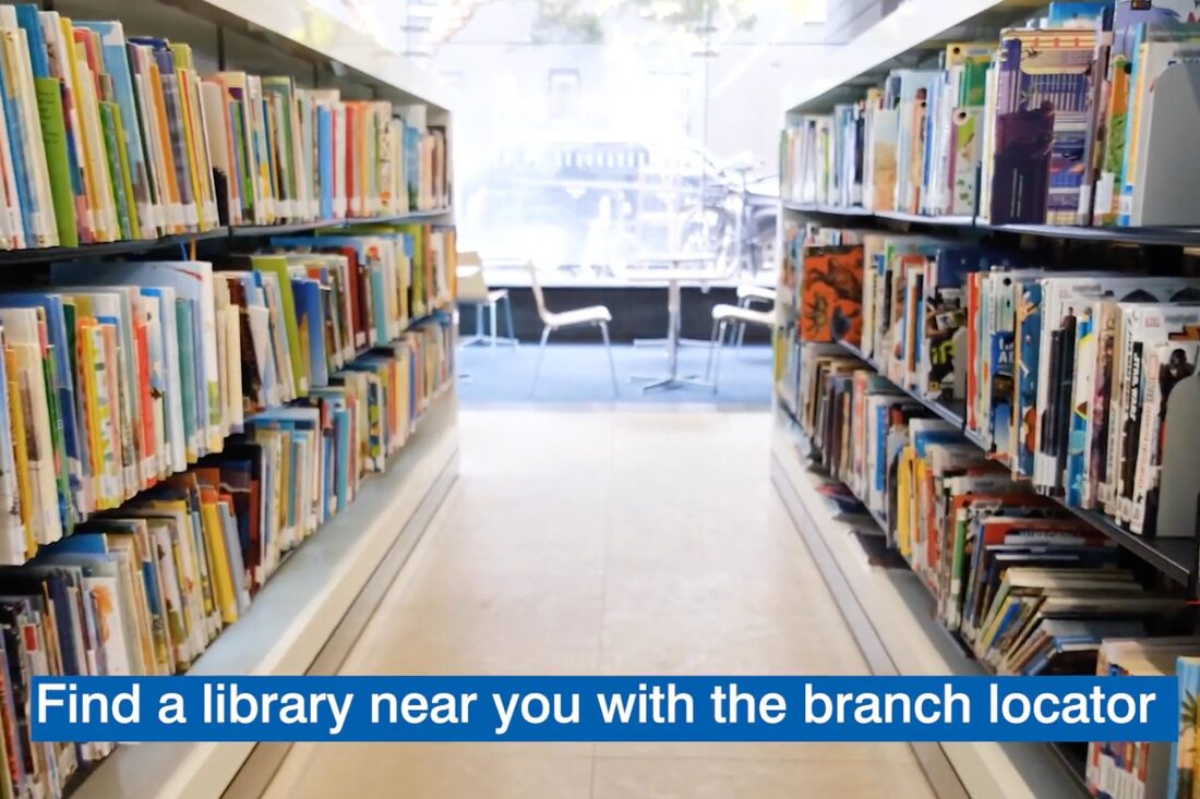
Patrons don't just want to know a book exists — they want to know where it is before they travel. Surfacing branch-level availability as a first-class feature turned a catalogue into a logistics tool.
A power-user persona would push toward richer discovery and reading community features. Anchoring on Sarah kept every decision legible: short sessions, moderate tech comfort, task completion over exploration.
The City of Sydney Library App — an overview of the service and how it works for patrons.
Sarah reads broadly and borrows for herself, her partner, and her kids. She moves between fiction, non-fiction, and children's titles depending on who needs what. She's not a power user — she doesn't browse catalogues for fun — but she relies on the library as a practical household resource. Time is short, and any friction in the system costs her trust.
Answers Sarah's three core questions without a single tap. The existing website required navigating to account screens before seeing any loan status.
Three stat tiles — loans out, due soon, holds ready — give Sarah a complete picture before she scrolls. Colour-coded urgency: red = act now, green = ready.
Current gap: no dashboardFix: contextual greeting + live statsMost time-sensitive loans surface directly with a one-tap Renew button. A greyed button signals the item isn't yet eligible, preventing frustration.
Fix: renew in one tap from homeWhen a hold is ready, it appears as a persistent green pill with branch name and expiry date. Sarah sees the window she has to act.
Current gap: hold status buriedFix: expiry-aware pickup promptRelated titles appear inline below active loans — not as a tab to find, but in the flow. Triggered by what she's currently reading.
Fix: contextual, not navigationalSorted by urgency first — overdue, due soon, general — with inline renew and visual time indicators. The website showed a flat list with no hierarchy.
Quick-filter chips let Sarah triage by urgency. Tap "Overdue" to see what needs immediate action — no account dropdowns required.
Current gap: flat, unfiltered listFix: status-first filter chipsThe overdue item shows the accruing fine inline, a red progress bar at 100%, and a high-contrast Renew button. Consequence and action in a single glance.
Current gap: fines not surfaced clearlyFix: inline fine + urgent CTAA subtle progress bar under each title shows how far through the loan period she is. Amber at 75%, red at overdue. Replaces mental date arithmetic.
Fix: visual urgency, not just datesLoans from linked family cards appear in the same list with a subtle account tag. Sarah manages the whole household without switching accounts.
Current gap: family loans require account switchingFix: unified household viewEvery hold is transparent and actionable. Queue position, ETA, expiry countdown, and branch transfer status — none of which were visible on the website.
A hold-ready card shows the branch, an expiry countdown, and a Directions button. Losing the hold and rejoining the queue is now a visible risk, not a surprise.
Current gap: no expiry countdownFix: expiry-aware CTA + branch directionsPosition (#3 of 8) and an estimated wait range (3–5 weeks) converts an anxiety-producing mystery into a manageable expectation.
Current gap: queue position invisibleFix: position + estimated waitOrigin and destination branch shown alongside expected arrival window. Sarah knows not to travel until the book arrives at her preferred branch.
Current gap: transfer state not shownFix: live transfer status with ETABranch-level availability surfaces as the primary signal in every result card. The question isn't "does this book exist?" — it's "can I get it now, and from where?"
Full-width search field stays accessible from any state. Fast and direct — the entry point mirrors the urgency of Sarah's short sessions.
Fix: context-aware, top-of-pageFilters for available now and near me reframe search around her actual decision-making. Genre filters are secondary but accessible.
Current gap: no availability filterFix: availability as first-class filterEach result card shows branch-level availability as coloured pills: nearest branch in blue, available in green, unavailable in grey. No tapping through.
Current gap: availability requires tapping throughFix: branch availability in result cardThe action button changes based on availability: Hold, Transfer, or Queue. Sarah requests a branch transfer directly from the search result — no separate screen.
Current gap: transfer not surfaced in searchFix: context-sensitive CTA per availabilityTransforms a branch directory into a decision-making tool. "Is it worth going to this branch today?" is answered before Sarah leaves the house.
A map thumbnail shows Sarah's position relative to nearby branches. Her home branch is starred. Spatial anchoring before reading a single word.
Current gap: list only, no map contextFix: map + list combined viewPreferred branch pinned and starred. Surfaces holds ready for pickup and how many wishlist titles are on the shelf. Real information replaces guesswork.
Current gap: no preference or stock signalFix: home branch pinned with personalised dataBranches closing within two hours show "Closes 5pm" in amber. If she's considering Surry Hills, she knows she needs to leave now.
Current gap: binary open/closed onlyFix: time-aware closing statusEach branch card shows how many saved titles are currently on the shelf. She picks the branch that has what she wants, not just the nearest one.
Current gap: no personal stock signal per branchFix: wishlist availability per branch